Michelle DaSilva
Portfolio · Case Study

This case study is password protected.
Enter the password to continue.

Don't have the password? Request access

Back to Work
Case Study 002 · Fintech & Security

RSA Authenticator:
Self-Service
Enrollment.

A guided desktop and mobile flow that lets business owners enroll in RSA multi-factor authentication entirely on their own — replacing a manual process that required a phone call to a customer service representative for every request.

Live Today
25%
Of the Business Banking population already self-serving RSA setup — with the rest of the rollout underway.
Client
Leading US Bank
Role
UX Design Lead
Scope
Flow Design · Usability Testing
Platform
Web · iOS · Android
Status
Live — Phased Rollout

Turning a Manual Security Step Into a Self-Service Flow

Requesting a hardware or software security token used to require a phone call. I led the research and flow design for a self-service enrollment experience that lets business owners set up RSA multi-factor authentication on their own — on desktop or mobile — without contacting support. The design was validated through a moderated usability study before shipping, and the RSA Authenticator setup flow is now live as one of the Quick Actions in the bank's enhanced Access & Security Manager experience.
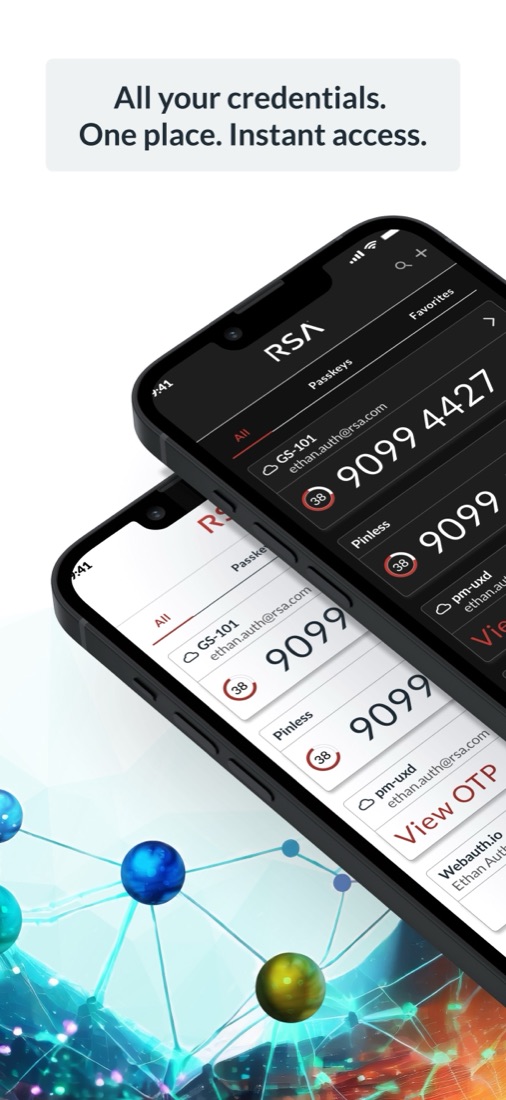
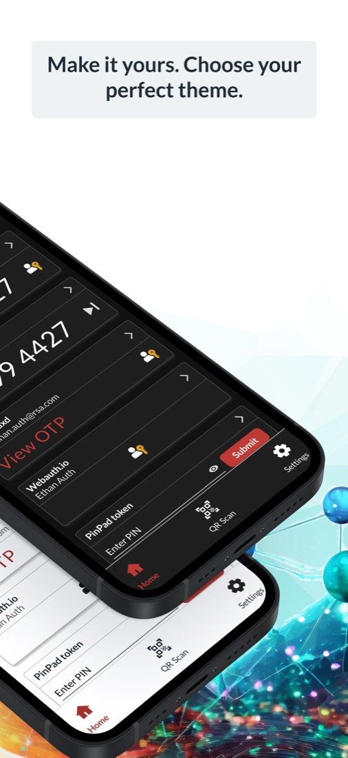
Official RSA Authenticator app marketing screenshot — 'All your credentials. One place. Instant access.' Official RSA Authenticator app marketing screenshot — 'Make it yours. Choose your perfect theme.'

A Critical Security Step, Gated Behind a Phone Call

Business owners who wanted to add multi-factor authentication to their account had no way to do it themselves. Every request routed through a customer service representative — a slow, manual process that discouraged the very security behavior the bank wanted to encourage.

Manual & Slow
CSR-Dependent Token Requests
Every token request required a call to a customer service representative — inefficient for the customer and costly for the bank at scale.
No Self-Serve Option
There was no way for an admin to enroll in stronger authentication on their own — removing a security upgrade that should have been a few clicks away.
Risk Left on the Table
Without integrated step-up authentication, high-risk actions weren't as protected as they could be — a missed opportunity for both security and customer confidence.
How Might We
Make the RSA enrollment and setup process easy and informative for first-time users, so they understand its security benefits and complete all steps successfully?

Moderated Usability Testing, Desktop & Mobile

Before this shipped, I partnered with two UX researchers to test the proposed enrollment flow with real business banking clients — recruiting participants who had expressed interest in or experience with additional security measures like MFA, to best mimic the customers most likely to use RSA. Each of the 16 participants (8 desktop, 8 mobile) completed a moderated, think-aloud session across two tasks: setting up multi-factor authentication, then signing back in using it.

A participant at their desktop, holding a phone showing a biometric security prompt — representing the desktop-to-mobile handoff tested in this study
Team Hypothesis 01
The flow for both mobile and desktop will feel excessively long.
Team Hypothesis 02
Users are likely to experience confusion and frustration when asked to reset their password at the end of the flow.
Team Hypothesis 03
The requirement to scan two separate QR codes in the desktop version may cause confusion.

A Guided, Three-Step Enrollment Experience

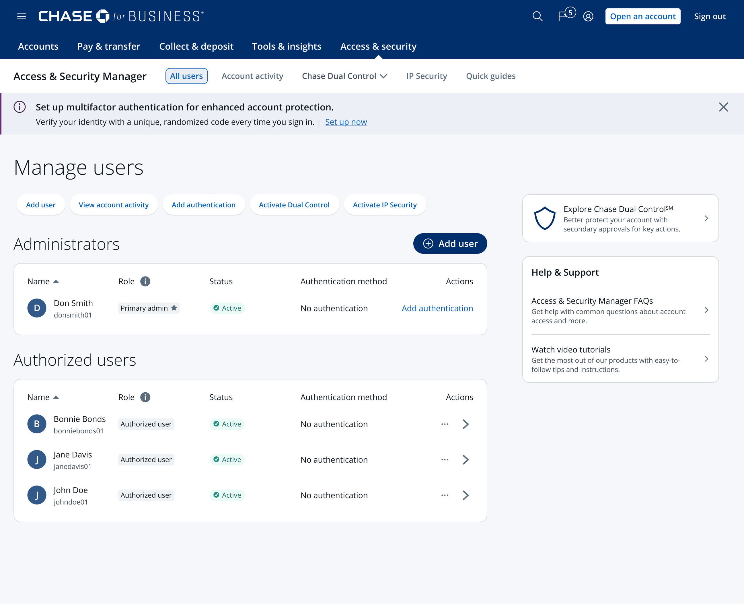
The entry point lives directly on the All Users dashboard, where an admin can add authentication to their own account or a sub-user's in a few clicks. From there, the flow walks the user through downloading the RSA Authenticator app, activating it, and confirming their new sign-in method — on whichever device they start on. Click any screen to view it larger and step through the full flow.
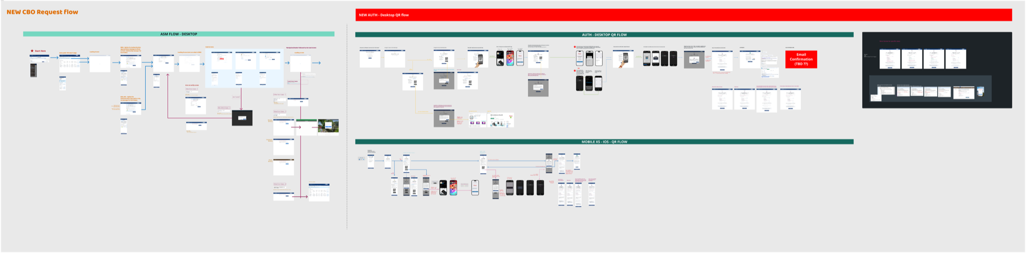
End-to-end flow diagram: ASM desktop entry point, desktop QR activation flow, and mobile QR flow
The complete flow, mapped. Desktop entry point, desktop QR activation, and the parallel mobile QR flow — planned together before any screen was built.
1 All Users dashboard redesign highlighting the new 'Add authentication' entry point
Entry point. The redesigned All Users dashboard surfaces a banner and an inline "Add authentication" link for every admin without an authentication method on file.
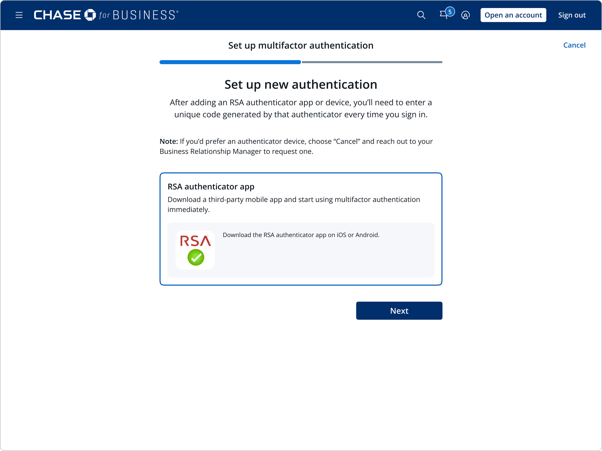
2 Set up new authentication — select the RSA Authenticator App as the method
Choose a method. The RSA Authenticator App is presented as the self-service option, with a note on requesting a hardware device instead.
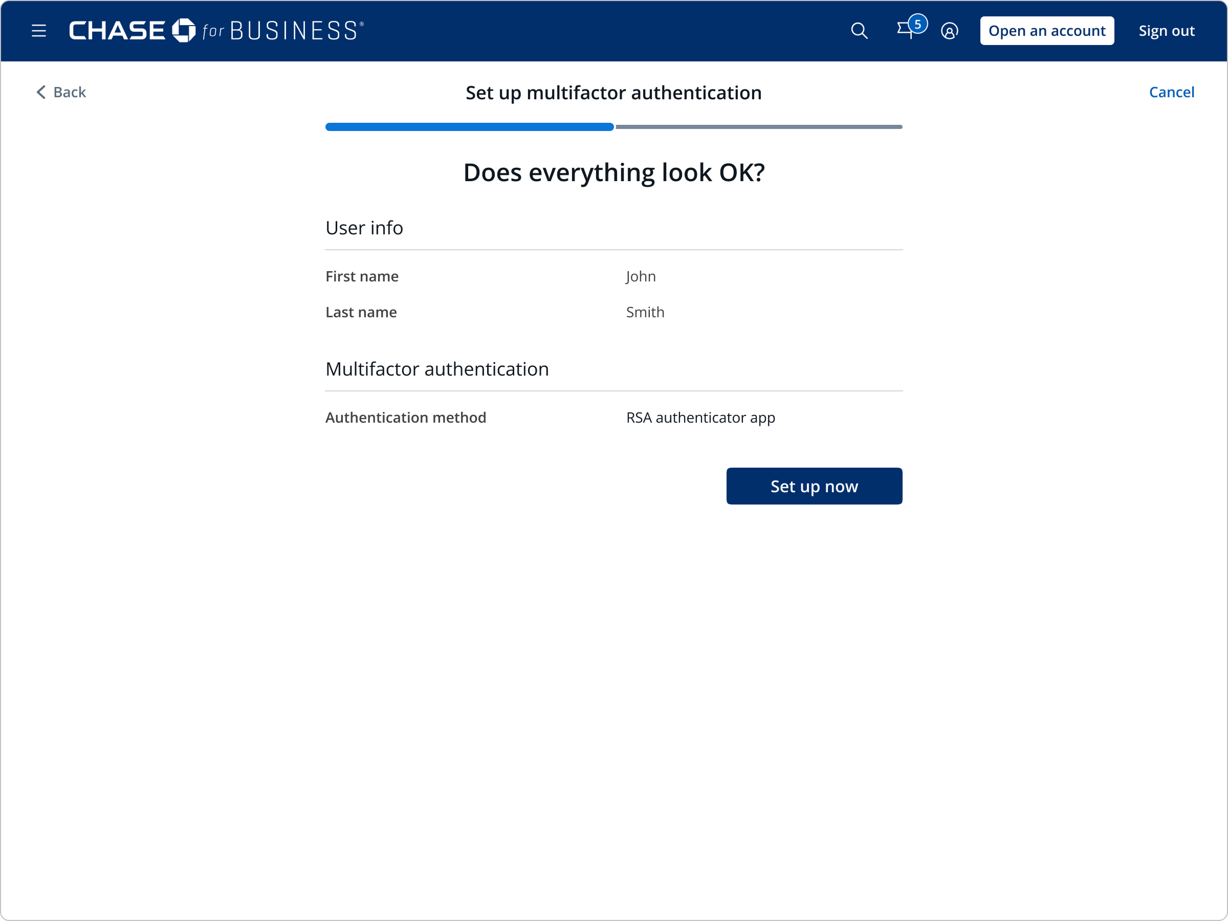
3 Does everything look OK? A summary of user info and the chosen authentication method before setup
Review before committing. A summary of the user and the chosen authentication method, with a clear point to go back and change it.
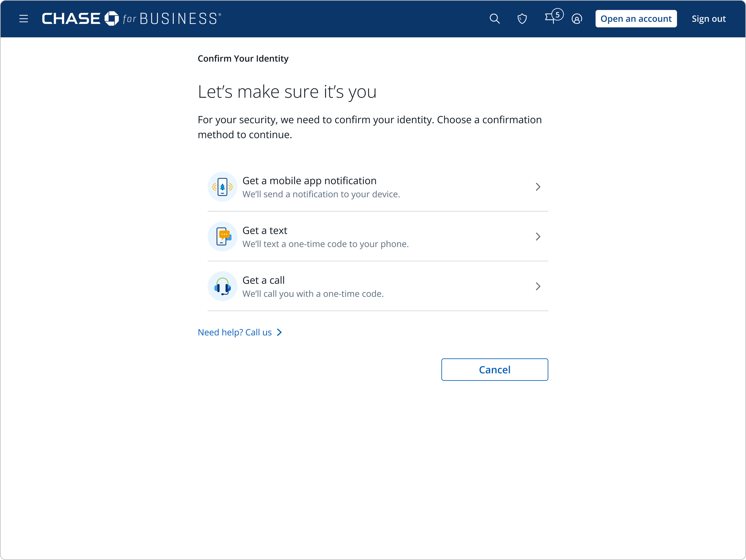
4 Confirm your identity — choose a step-up confirmation method
Identity confirmation. A step-up check — mobile notification, text, or call — confirms it's really the account owner before continuing.
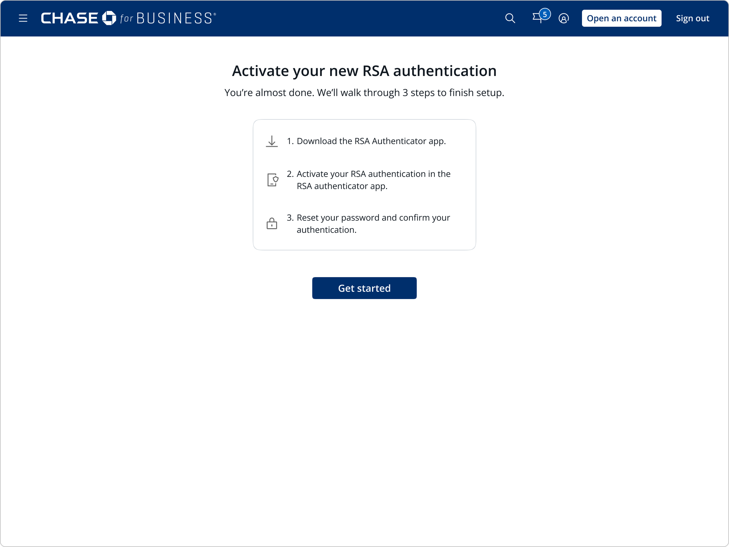
5 Activate your new RSA authentication — a 3-step overview before starting
Set expectations. Before diving in, a simple 3-step overview previews the whole process: download, activate, then reset password.
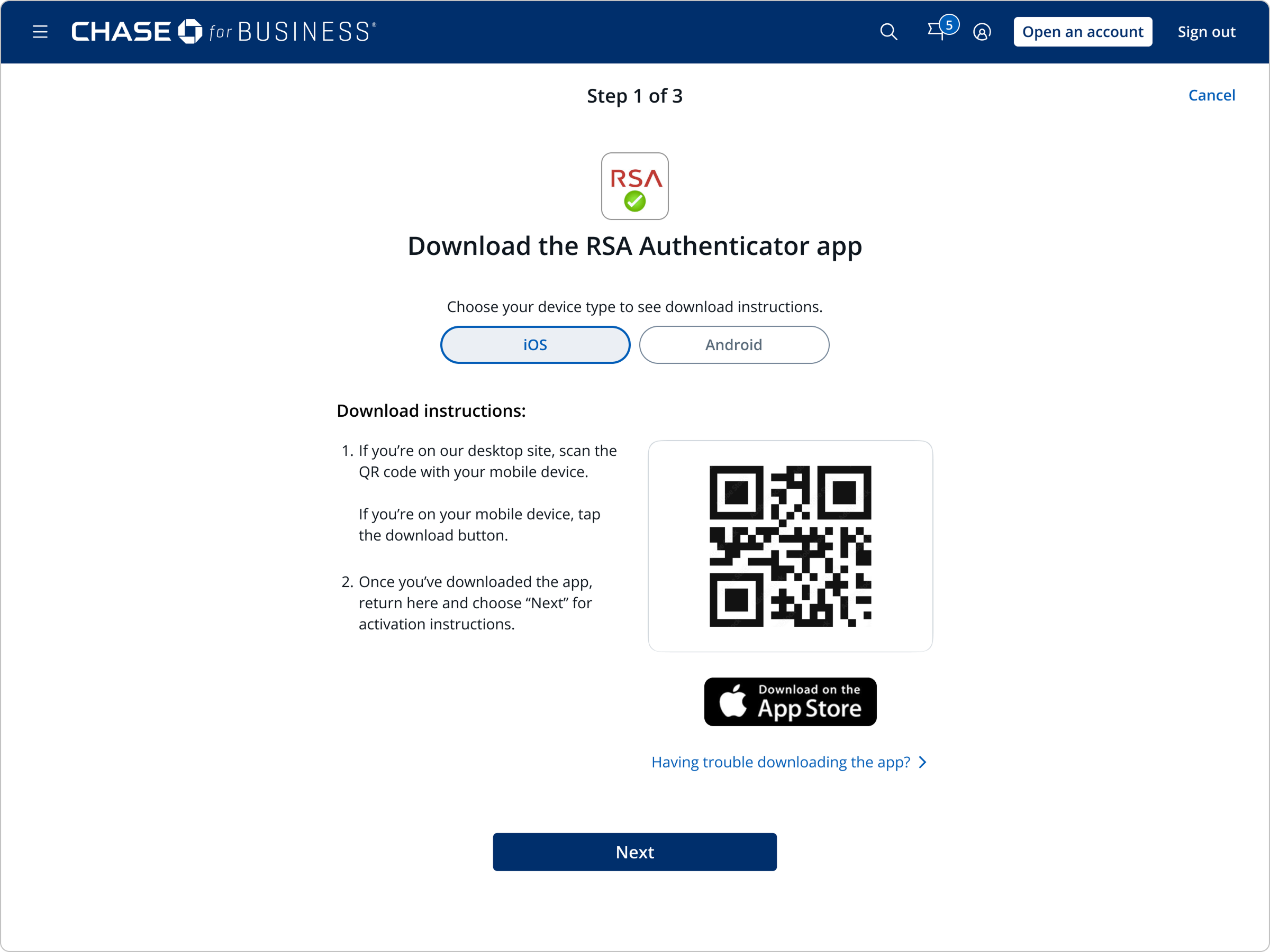
6 Step 1 of 3: choose a device type and scan a QR code to download the RSA app
Step 1 of 3. Pick a device type and scan a QR code to jump straight to the app store on mobile.
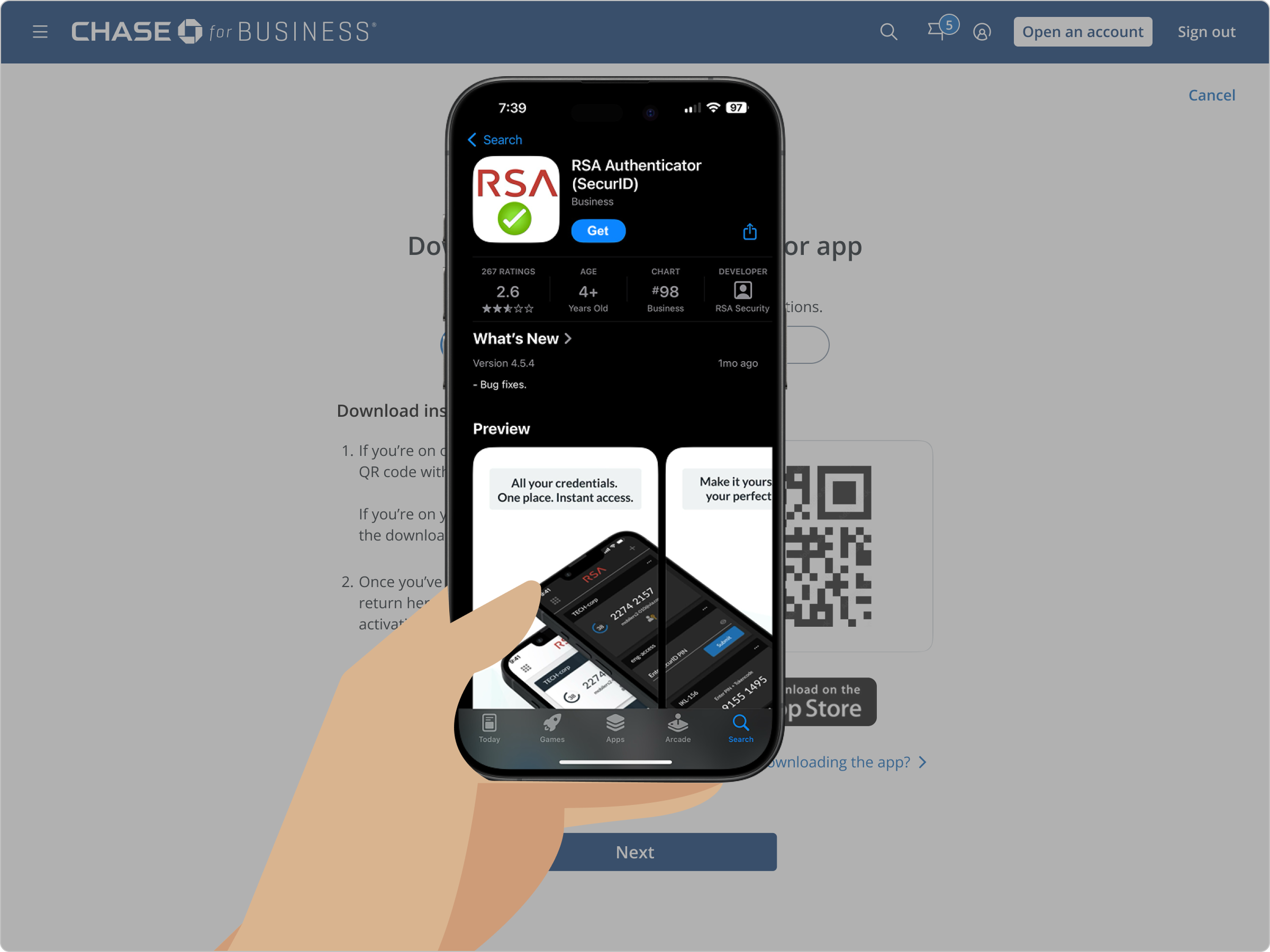
7 The RSA Authenticator app listing in the App Store
App download. A standard app store install for the RSA Authenticator (SecurID) app.
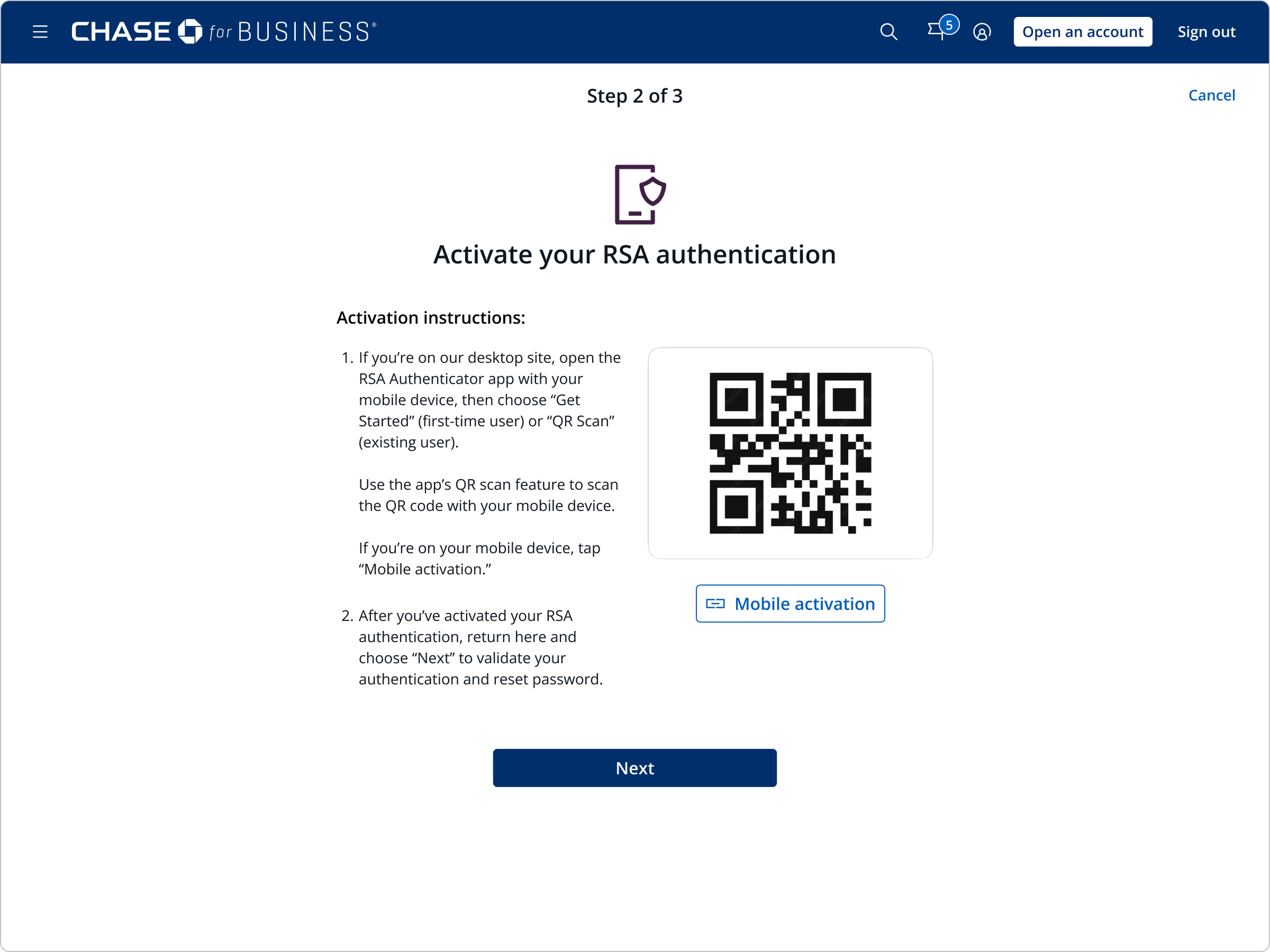
8 Step 2 of 3: a second QR code activates the RSA app
Step 2 of 3. A second QR code links the newly installed app to the account — the step research flagged as a confusion point (more below).
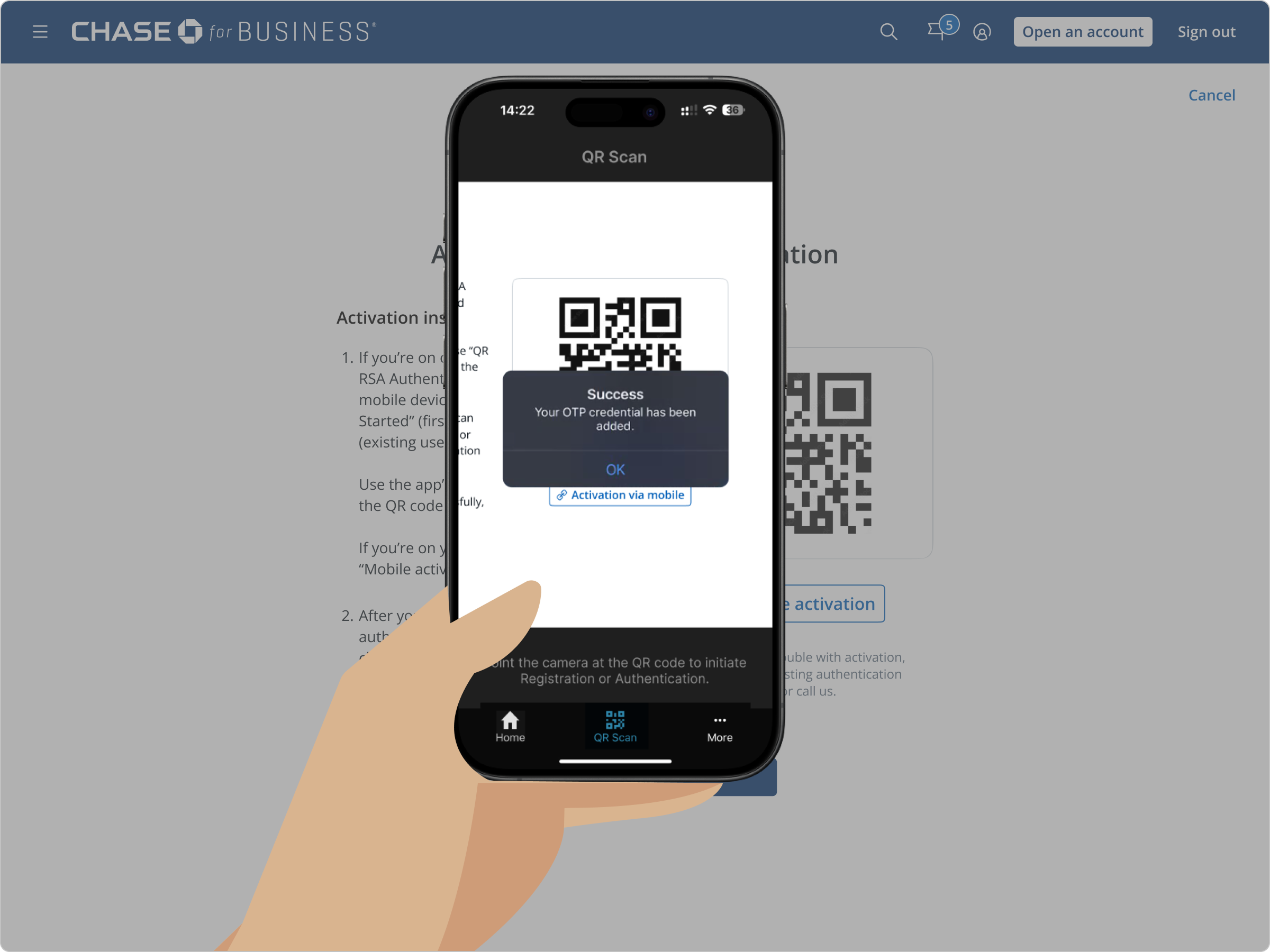
9 Inside the RSA app, a success message confirms the OTP credential was added
Activation. The RSA app scans the second code and confirms success — the credential is now added.
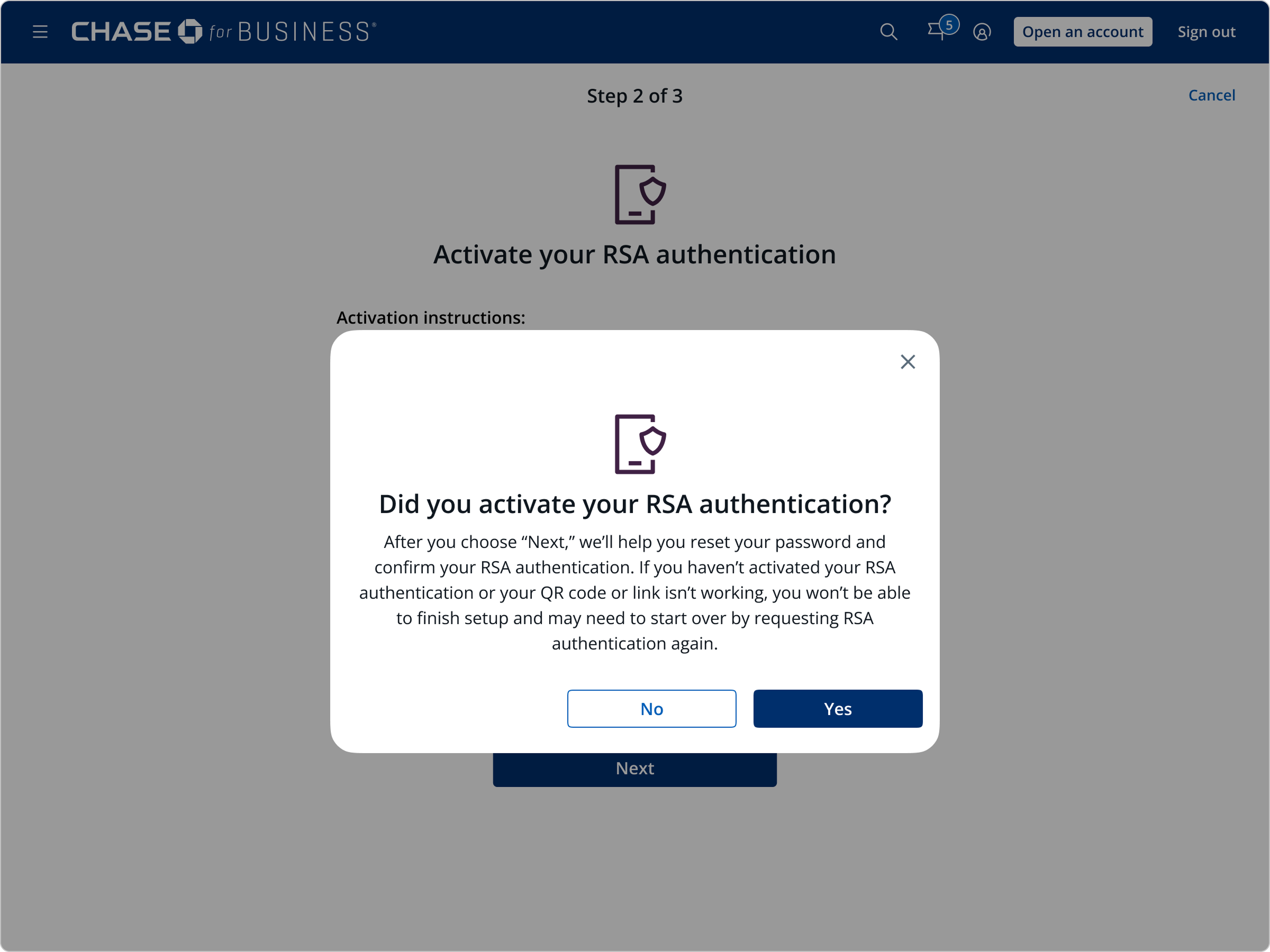
10 A confirmation speed bump asks: did you activate your RSA authentication?
Confirm before continuing. A speed bump checks the app was actually activated before moving to the final, harder-to-reverse step.
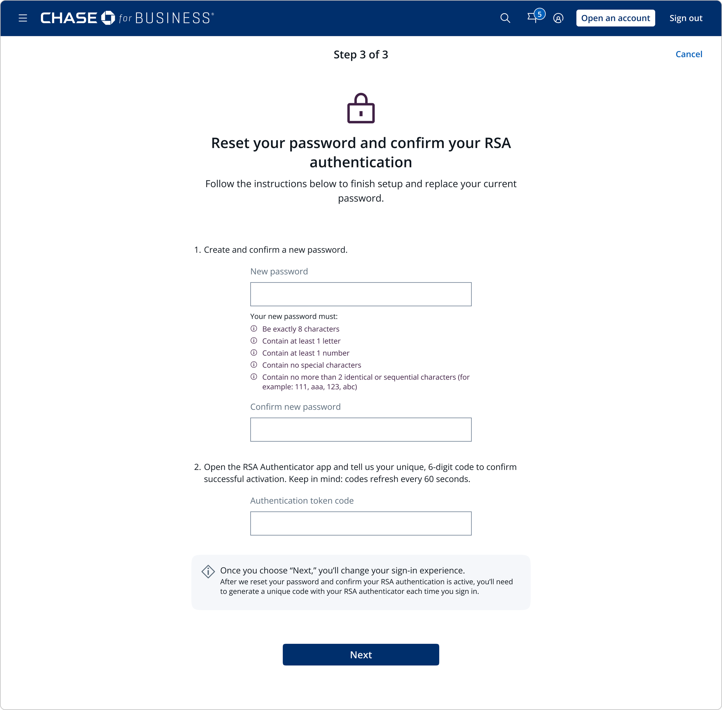
11 Step 3 of 3: reset password and enter the RSA authentication token code
Step 3 of 3. The final step: create a new password and enter the live token code generated by the app.
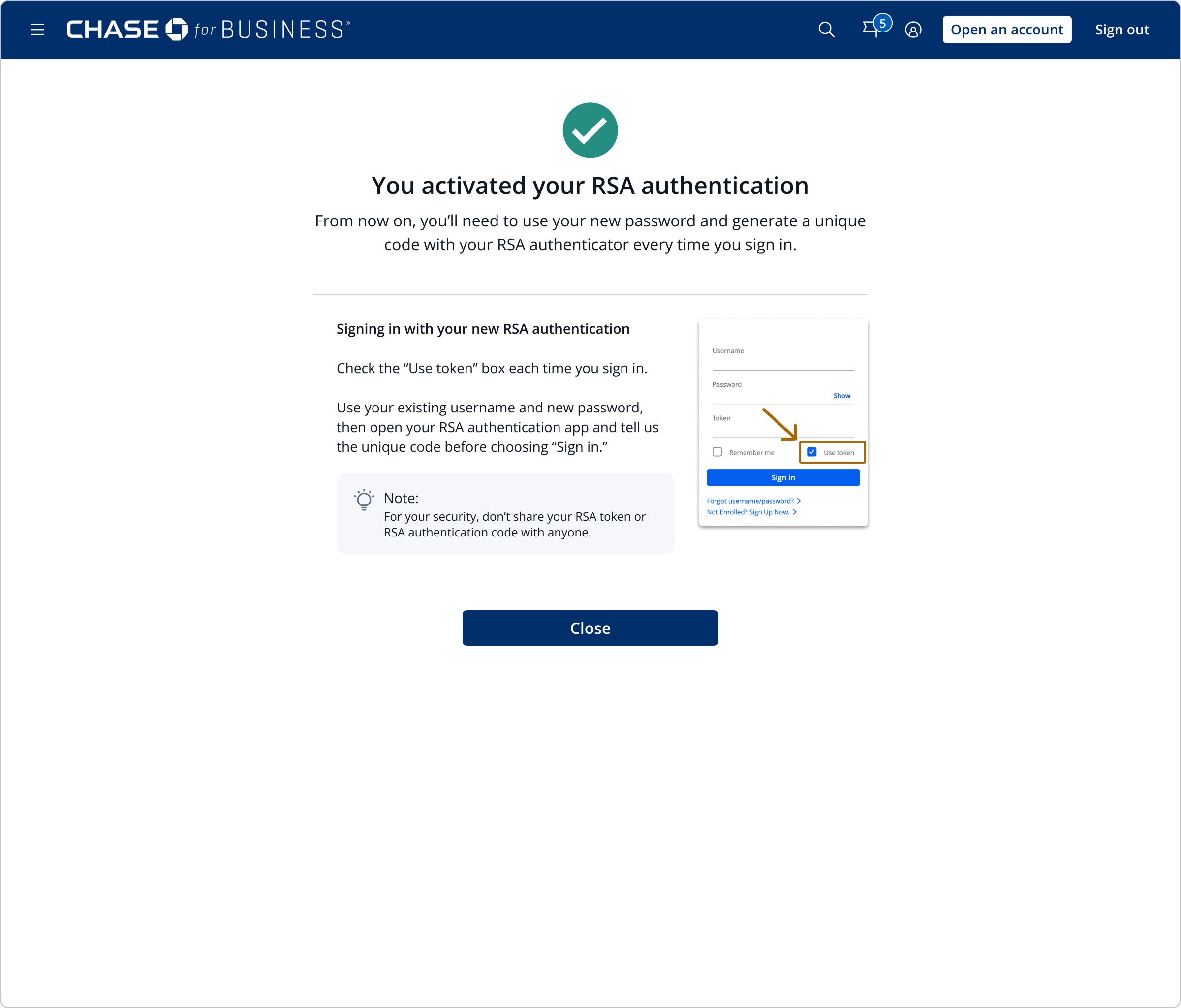
12 Confirmation screen showing how to sign back in with the new RSA-backed credentials
Confirmation. The user is signed out for security and shown exactly how to sign back in with their new password and a live token code.
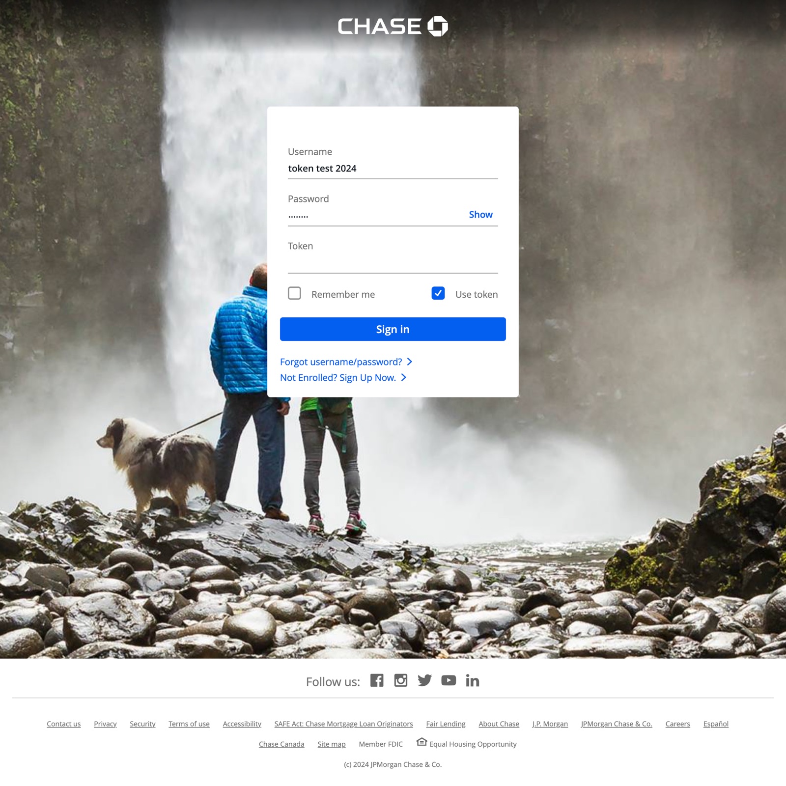
13 The sign-in page going forward, now with a Token field alongside username and password
Signing in, going forward. Every future sign-in now includes a Token field alongside username and password, where the user adds the current 6-digit code from the RSA app.

What We Learned, Beyond the Hypotheses

Testing confirmed two of the team's three hypotheses, disproved the third, and surfaced several findings the team hadn't set out to look for.

General Findings — Desktop & Mobile

Themes that showed up regardless of which device a participant used.

About the Setup Process
Nearly everyone found the flow too long. Only 2 of 16 participants didn't mention the length — both on desktop, one of whom had recently gone through an RSA setup before.
The prototype undersold the real friction. It was more streamlined than the actual process (real downloads, switching devices), so the team expects the live flow to feel even longer, with a real risk of drop-off.
Security bought tolerance for length. Even so, some participants said they'd accept a longer process specifically because it's for their own account security.
Password reset was not the problem. The team's expectation that it would be a significant concern was not confirmed — no participant pointed to any single step, including password reset, as the source of their frustration.
About Prior Habits & Expectations
High familiarity with authenticator apps — 100% of desktop and 88% of mobile participants — let them compare this flow directly to tools they already use.
Some preferred not to add another app. A few said they'd rather keep using Google Authenticator than install a second one, and a couple felt this setup ran longer than what they were used to.
Integrated solutions were the benchmark. Many said they liked their current methods specifically because they were seamless, consistent, and integrated — citing examples like Face ID and Google Authenticator.
The "Use token" checkbox felt redundant. Some pointed out that once a token is required for every sign-in going forward, having to manually check that box each time doesn't make sense — it should just be on by default.

Where Desktop and Mobile Diverged

Two findings that only showed up on one platform.

Desktop — the Second QR Code Caused Confusion
The first QR code (download) matched expectations and felt familiar. The second (activation) caused brief confusion — participants were unsure of its purpose, or whether they'd already completed that step, partly because it looked visually similar to the first. The prototype's linear structure meant everyone still proceeded successfully — confirming hypothesis 3.
Mobile — the Entry Point Was Hard to Find
The entry points are the same as desktop, but participants had difficulty noticing them on mobile. A few also tried tapping a sub-user's name or "Manage user" instead, causing confusion about whose authentication method they were actually setting up.

The QR code confusion becomes obvious side by side — same layout, same visual weight, same "scan this" instruction, just a different purpose:

QR 1 The first QR code screen, used to download the RSA app
First QR code — download. Familiar territory: scan to get the app.
QR 2 The second QR code screen, used to activate the app
Second QR code — activation. Same layout, same visual weight — easy to mistake for a repeat of step one.

What These Findings Meant for the Design

Each finding was translated into a specific, scoped recommendation — rather than a general call to "make it simpler."

Insight Recommendation
Nearly everyone complained about the length of the flow, but didn't point to a specific step as the culprit. Remove the password reset step where possible, and look for ways to make the remaining flow "feel" shorter.
Participants struggled to find the entry point in the mobile version. Make entry points more salient with clearer text and visual signals on the dashboard.
The two separate QR code screens led to confusion about progress and purpose. Create distinct visual and verbal signals to differentiate the download QR code from the activation QR code.
Any content removed to shorten the flow could leave gaps in understanding. Add a lightweight FAQ section so users can self-serve more detail without lengthening the default path.

From Research Study to Live Feature

The recommendations from this study fed directly into the enrollment flow, which began rolling out in mid-2026 as part of the bank's broader Access & Security Manager modernization. RSA Authenticator self-serve is now live for an initial segment of business banking clients — with a dashboard banner driving awareness — no CSR call required. Next: expanding to the rest of that population, then to additional Business Banking segments and Commercial Banking clients.

16
Participants Tested
Moderated, think-aloud usability sessions across desktop and mobile with business banking clients.
100%
Proceeded Past the Confusion
The flow's linear structure meant every participant still made it past the most confusing moment (the second QR code) and finished setup.
Live
Initial Segment Rolled Out
Launched in mid-2026 to an initial segment of business banking clients, with the remaining population to follow.

Reflection

"The most useful finding wasn't the one that confirmed our worries — it was the one that disproved them. Knowing what isn't the problem is just as valuable as knowing what is."

Michelle DaSilva · UX Design Lead · Leading US Bank