 Michelle DaSilva
USPharma
Drupal
Design System.
As UX Design Lead, I oversaw a team of product designers, researchers, and content designers building a scalable design system for all Novartis US Pharma websites — launched on Cosentyx in late 2022 with measurable improvements across every engagement metric.
Overview
What is the US Pharma Design System?
The US Pharma Drupal Design System is a set of pre-built, reusable components, patterns, principles, best practices, and guidelines that allows its users to build consistent web experiences across the entire Novartis pharmaceutical brand portfolio.
By using the pre-built components, teams spend less time designing and building — and more time customizing their web sites to address specific end user needs. The system serves patients, healthcare professionals, and internal brand teams simultaneously.
The Problem
Five User Types. One Shared Frustration.
Research spanning patients, healthcare professionals, biologics coordinators, office staff, and field representatives surfaced the same core problem: a fragmented digital estate where every brand site operated independently, with no shared navigation logic, IA patterns, or compliant design foundation.
"As a HCP I am confused how to access HCP brand site — I need to know which Novartis sites exist and where to go for specific information."

"I can't find clear information about my treatment or what support is available."

"It's not clear where to go or what clinical resources are available for my patients."

"Finding patient support resources across multiple brands takes far too long."

"Managing patient access across different brand sites is inconsistent and time-consuming."

"Finding the right up-to-date resources to share confidently is a challenge."
UX Strategy
Four Experience Principles
Every design decision across the US Pharma Drupal Design System was anchored in four experience principles — defined collaboratively with cross-functional stakeholders to ensure the platform would serve every user type, at every stage of their journey.
Create an experience customers return to. Deliver consistent, personalised, and reliable brand information across all touchpoints — making every visit purposeful and every interaction meaningful.
Be a trusted partner to HCPs, patients, and caregivers. Provide clinically accurate, MLR-approved content in a clear and accessible format that instills confidence at every touchpoint.
Design system components that work across all Novartis brands without bespoke builds. One scalable platform that serves many brands — agnostic to therapy area, brand identity, or market segment.
Reduce time-to-market for new brand experiences through reusable, pre-approved components and a streamlined MLR review process. Move faster without sacrificing quality or compliance.
Why USPH Drupal DS?
4 Objectives That Shaped Every Decision
Ensure brand & design consistency, meet performance, quality, and accessibility standards, and reduce the effort of UI Designers and FE Developers.
A single source of truth for all digital touchpoints — eliminating the inconsistency created by brand teams working in silos across agencies and platforms.
Every component is designed and validated to meet WCAG 2.1 AA accessibility standards, MLR compliance patterns, and Novartis technical performance benchmarks before release.
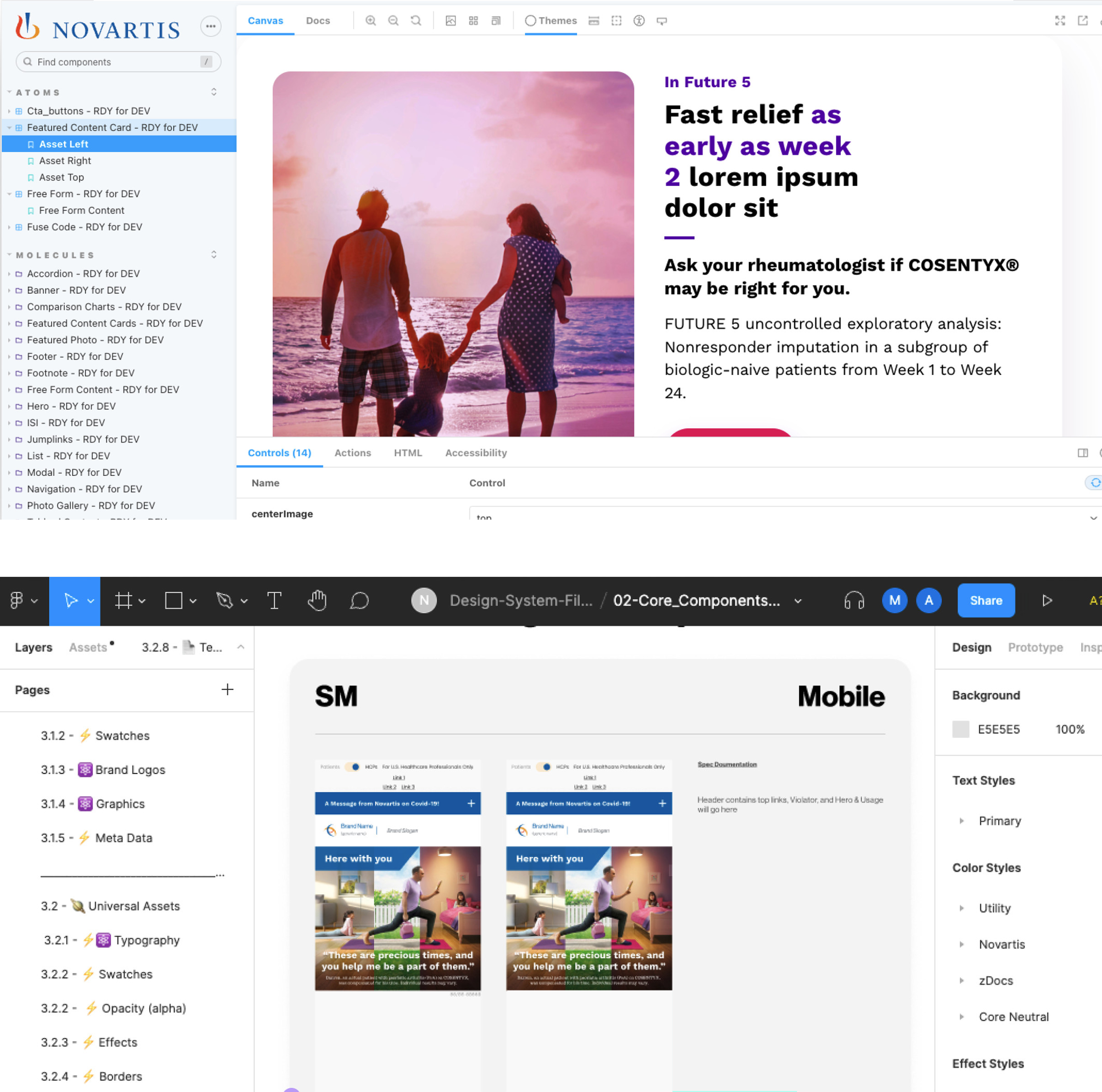
An atomic design library in both Figma and Drupal/React meant teams could assemble new brand experiences without rebuilding from scratch on every engagement.
Pre-approved, traceable components reduced the number of MLR review cycles required per brand site and dramatically shortened approval timelines.
Business Impact
Targeted Business Benefits
The design system delivered measurable value beyond individual brand launches — transforming the economics and speed of digital production across the entire US Pharma portfolio.
- A reusable web platform that enhances customer experience and omnichannel capability
- Reduce costs on website design and builds
- Reduce time to deliver and update websites
- Improve time to market
- More autonomy for brands
- Increased high-value conversions
- Achieve more reliable web performance benchmarks for SEO
- Better digital experiences for HCPs & Patients

Research Foundation
A System Built on Evidence
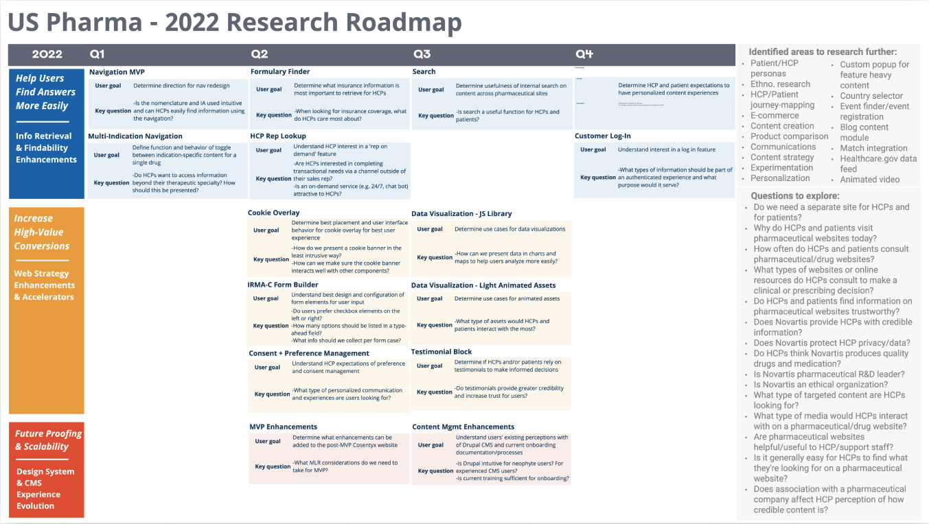
Every component and pattern in the design system was informed by structured research — usability testing with patients and HCPs, moderated sessions with CMS administrators, and continuous feedback loops embedded throughout the product lifecycle.
The 2022 Research Roadmap mapped user goals, key questions, and research stimuli across four quarters — covering navigation, findability, conversions, and future scalability.
Built for All
A System for Every Member of the Cross-Functional Team
The US Pharma DS serves designers, developers, marketers, and brand managers. Each audience gets the tools they need to contribute — without creating redundant work or inconsistent outputs.
Built for All Designers
The design system helps jumpstart designers on day one of any brand engagement. They have access to accessible, fully tested assets and guidance they can rely on to create cohesive experiences in line with Novartis standards.
Designers can quickly create tailored solutions for their brands using the atomic library design kit — saving time and money that could be spent on innovating new products or solutions.
Built for All Developers
The Drupal CMS design system provides reusable basic UI components in React and React Native so Front-End Developers can easily and rapidly implement user interfaces for desktop, tablet, and mobile devices.
Developers get the tools they need to build more sites in less time — saving them from creating the same base components repeatedly across engagements.
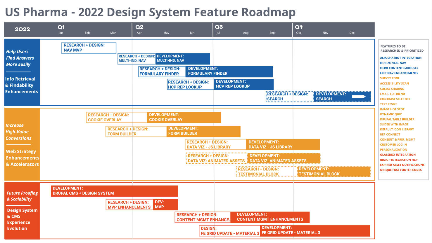
Research & Feature Roadmap
2022 Roadmap: Research-Driven Delivery
The 2022 roadmap organized work into three strategic themes — each with paired Research + Design and Development phases across Q1–Q4. Every feature shipped was grounded in validated user research before a single line of code was written.
Enablement
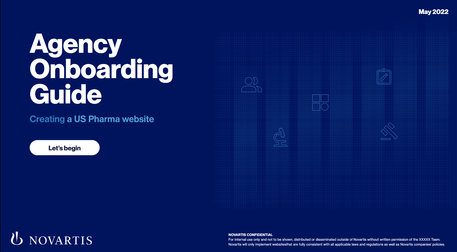
Agency Onboarding Guide
An interactive guide to help agencies and brands design and launch a US Pharma website. Designed to onboard external partners quickly and ensure every new brand engagement starts from a consistent, compliant foundation.
- High-level resource for agencies and brands
- Document for key contacts
- Reference for design and development processes
- Stepping stone with links to the Playbook and Design Toolkit (Figma files)
- Guide on how to use the Drupal CMS
- Design resource
MVP at a Glance
Our MVP Design System
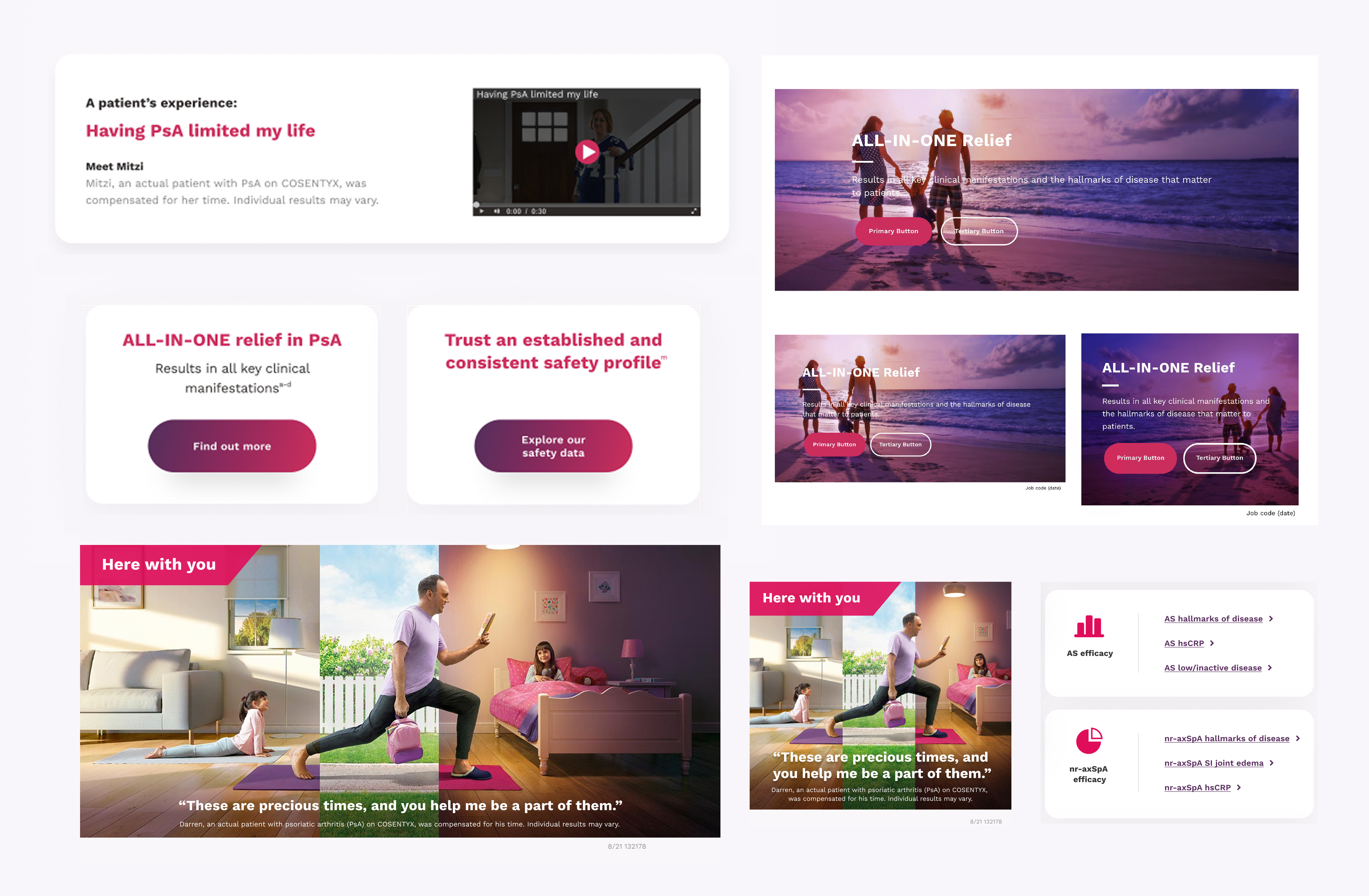
- Accordion
- Footnote
- Banners
- Hero
- Buttons
- Informational Elements
- Cards
- ISI
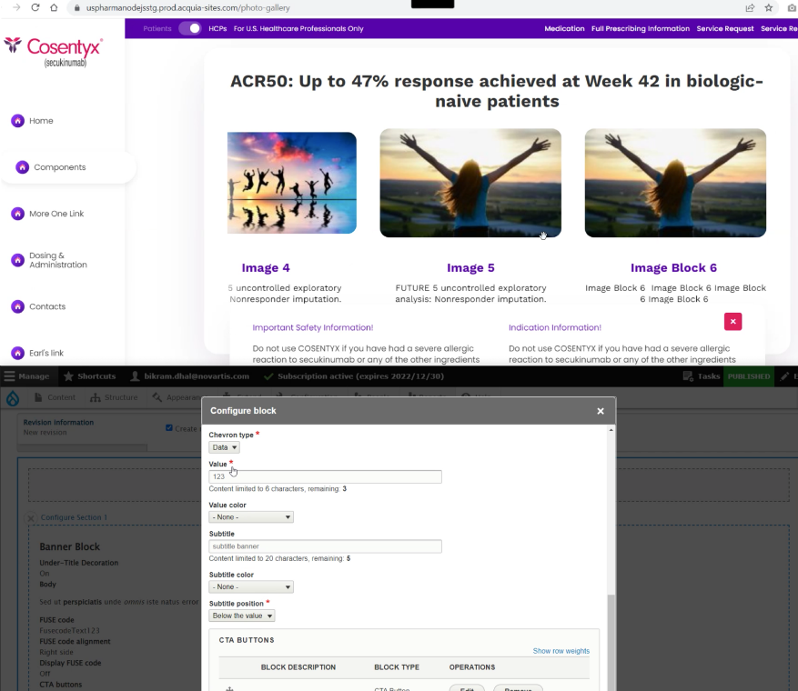
- Carousel (Photo Gallery)
- List
- Featured Content Cards
- Modals
- Free Form Content
- Sticky CTA
- Footer
- Navigation
- Google Font support
- Custom color palette
- Dynamic vertical spacing
- Icon libraries
- Plug and play modular content blocks
- Google Tag Manager
- Tealium
- Kaltura Video Streaming
- IRMA-C (later 2022)
Measurement
UX Success Metrics — 4 Phases
Success was measured across four distinct phases — from initial usability testing of the MVP design system through long-term business impact assessment. Each phase targeted a different audience with purpose-built research stimuli and metrics.
Outcomes
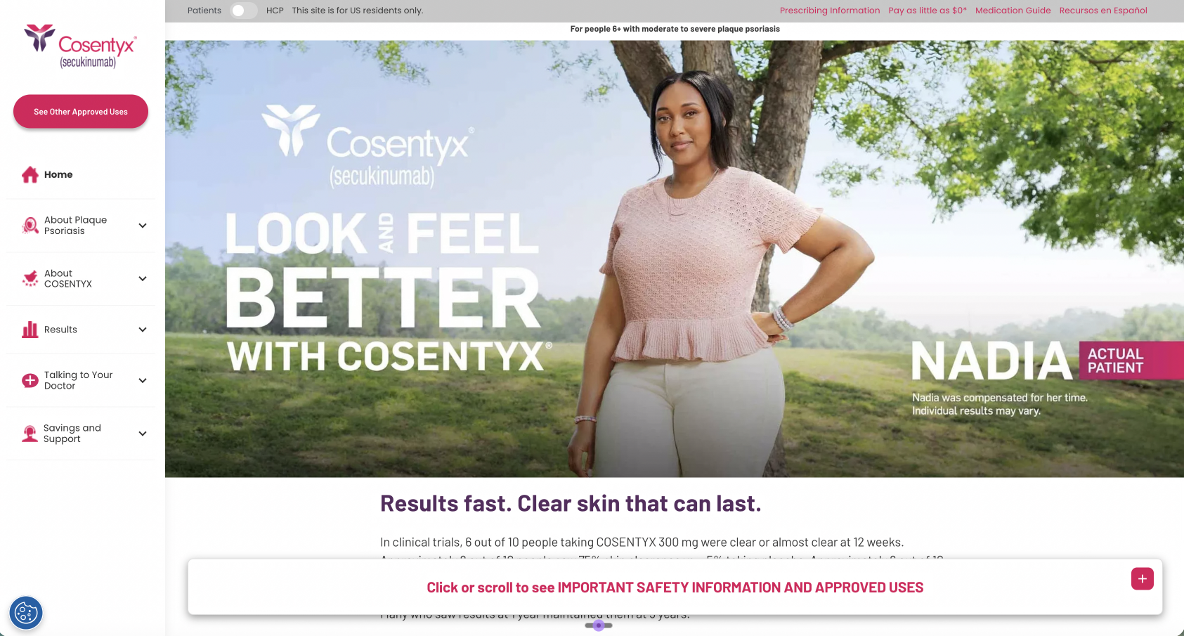
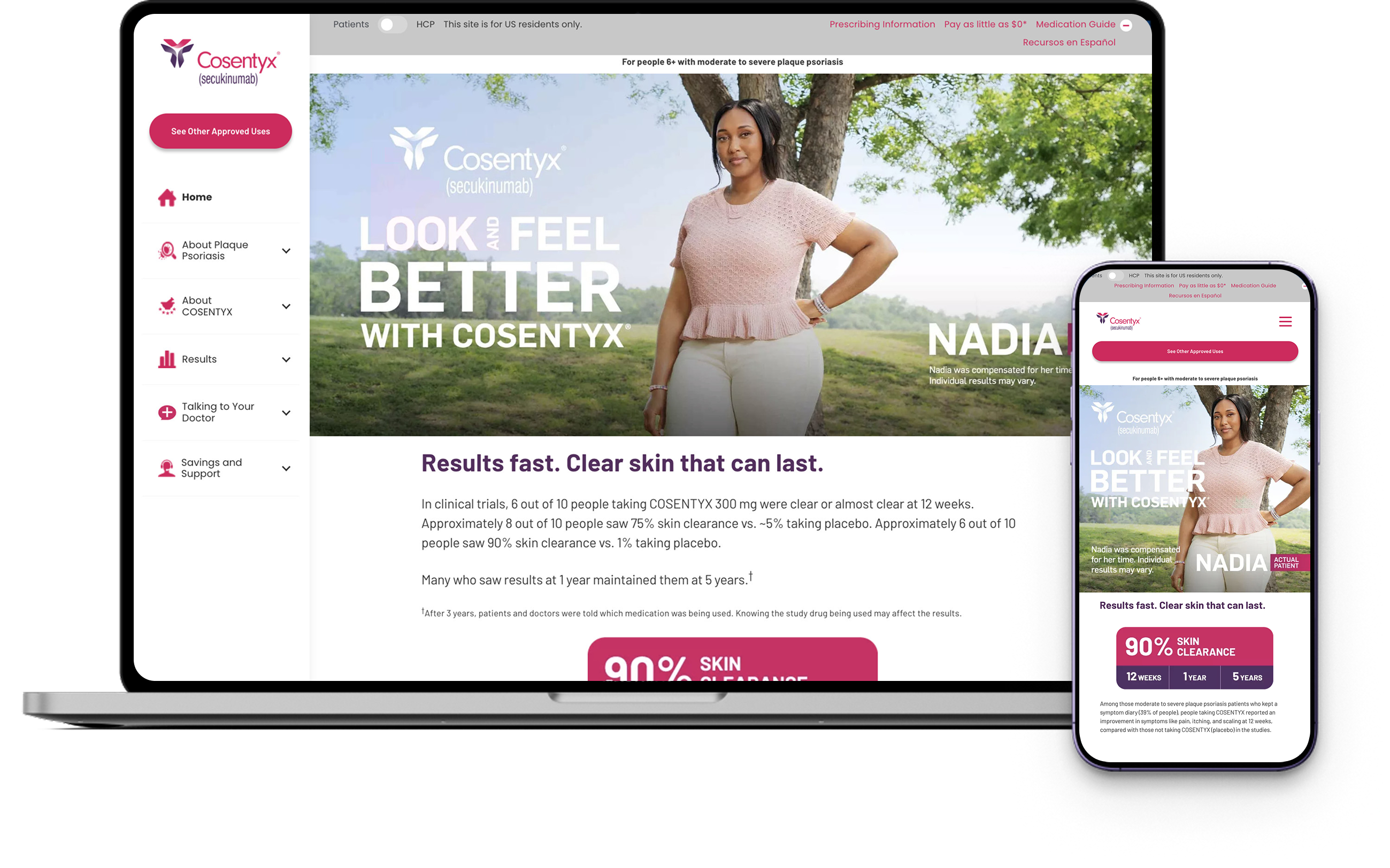
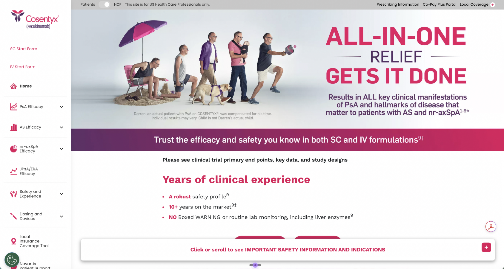
Success — Cosentyx (Rheum)
The first major brand launch on the US Pharma Drupal Design System — Cosentyx (Rheumatology) — delivered measurable improvements across all key performance metrics. The results validated the design system approach and set the benchmark for future brand deployments.